Fashion Color Psychology: How Hues Affect Style and Mood
Malik Mohsin Saleem Khan
July 25, 2023 · 13 min read
Introduction
The colors we choose to wear represent far more than aesthetic preferences—they communicate subtle messages about our personalities, influence how others perceive us, and even affect our own psychological state. Color psychology in fashion explores this powerful relationship between hues and human emotion, examining how different colors can project confidence, approachability, authority, or creativity depending on context and cultural associations.
This comprehensive guide delves into the fascinating science and art of color in fashion, providing insights into how strategic color choices can enhance your personal style while influencing both your mood and the impressions you make. Whether you're building a professional wardrobe, seeking to express your authentic self through clothing, or simply curious about why certain colors make you feel particular ways, understanding color psychology offers a powerful tool for more intentional dressing.
The Science and History of Color Psychology
The study of color's psychological impact has ancient roots, with evidence of color symbolism appearing in cultures worldwide for thousands of years. From Egyptian healing temples that used colored light to Chinese medicine's association of colors with specific organs, historical civilizations recognized color's power to influence human experience long before modern scientific investigation.
Modern color psychology emerged in the early 20th century, with Swiss psychiatrist Carl Jung pioneering the exploration of color's emotional effects. Jung proposed that color preferences revealed aspects of personality and developed color therapy approaches based on these connections. His work influenced subsequent researchers, including Max Lüscher, whose Lüscher Color Test became a significant psychological assessment tool linking color preferences to emotional states.
Contemporary scientific research has validated many traditional associations while providing neurological and physiological explanations for color's effects. Studies using functional magnetic resonance imaging (fMRI) have demonstrated that different colors activate distinct brain regions, triggering measurable physiological responses. For example, research published in the Journal of Environmental Psychology found that red environments increase heart rate and stimulate alertness, while blue environments tend to lower blood pressure and heart rate.
In fashion specifically, color psychology operates through both universal human responses and culturally conditioned associations. While some color effects appear consistent across populations—such as red's stimulating properties—others vary significantly between cultures. For instance, white symbolizes purity and weddings in Western traditions but represents mourning in many Eastern cultures. These cultural dimensions add complexity to color psychology in our increasingly global fashion landscape.
The Psychological Impact of Primary Colors
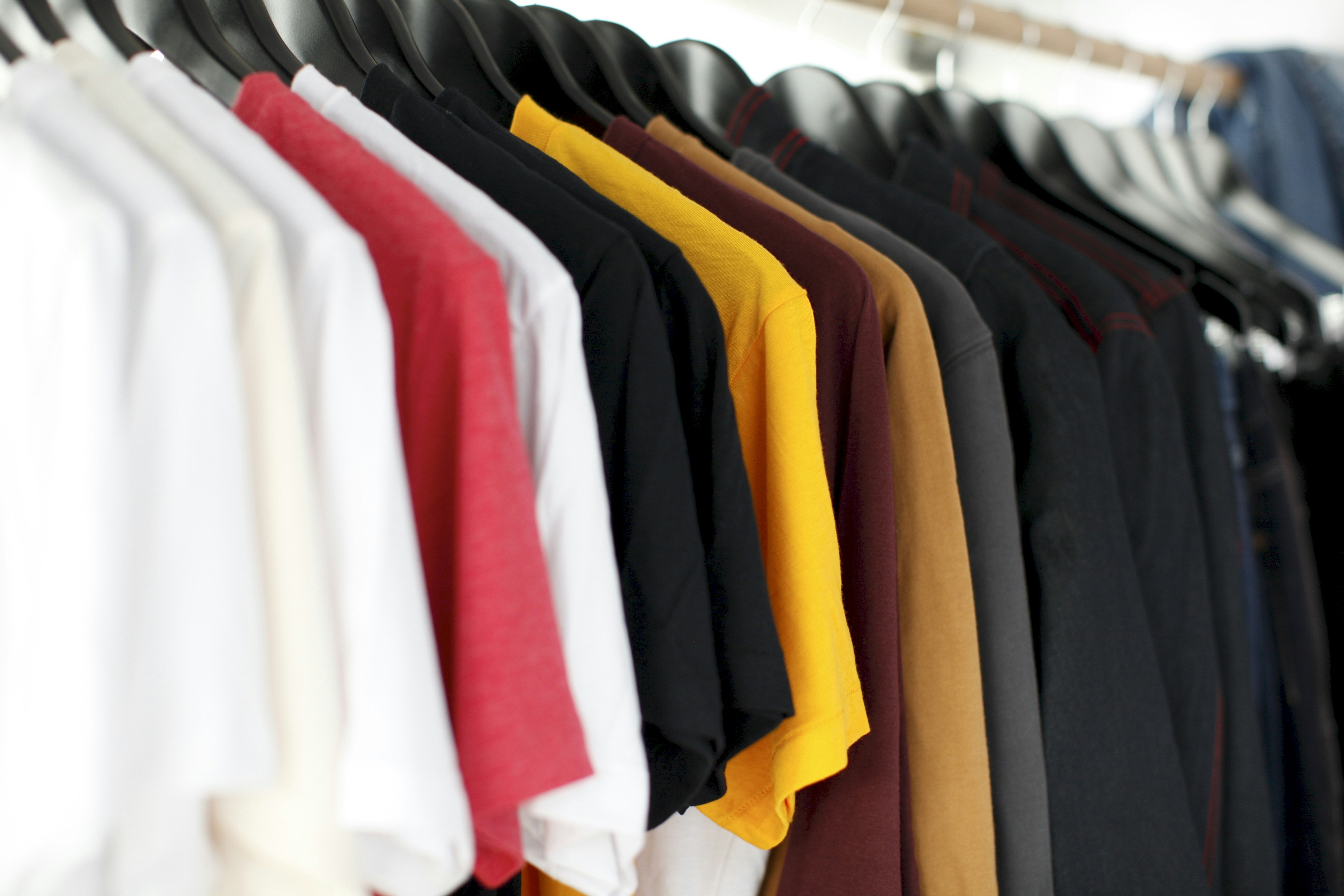
Primary colors—red, blue, and yellow—form the foundation of color theory and carry particularly strong psychological associations. Understanding these fundamental hues provides essential insights into how colors influence perception and emotion in fashion contexts.
Red stands as perhaps the most psychologically potent color, triggering immediate physiological responses including increased heart rate, respiration, and even hunger. In fashion, red communicates confidence, passion, and dominance. A study published in Nature found that athletes wearing red in competitive sports enjoyed a measurable advantage, suggesting the color's association with dominance affects both the wearer and observer.
Red's psychological impact makes it particularly effective for:
- Making memorable first impressions (the "red dress effect")
- Projecting authority in professional settings
- Creating focal points in an outfit
- Boosting confidence during presentations or important meetings
"When in doubt, wear red." — Bill Blass, fashion designer
However, red's stimulating properties can sometimes work against the wearer, potentially appearing aggressive or overwhelming in certain contexts. The intensity that makes red powerful also necessitates thoughtful application.
Blue consistently ranks as the world's most popular color across cultures and genders, likely due to its associations with stability, trustworthiness, and competence. Unlike red's excitatory effect, blue tends to lower blood pressure and heart rate, creating feelings of calm and security. Research by the University of British Columbia found that blue environments enhanced creative thinking, while other studies have demonstrated blue's ability to improve focus and productivity.
In fashion applications, blue conveys:
- Professionalism and reliability (explaining its dominance in corporate attire)
- Intellectual rather than emotional qualities
- Approachability combined with competence
- Versatility across formal and casual contexts
The psychological comfort blue provides makes it an excellent foundation color for wardrobes, though its very ubiquity can sometimes read as conventional rather than distinctive.
Yellow, the brightest color visible to the human eye, creates strong psychological and emotional responses that tend to be polarizing. Associated with optimism, energy, and attention-grabbing properties, yellow stimulates mental activity and memory. However, research has shown that yellow can also trigger anxiety when used extensively, and studies indicate it's the most fatiguing color to the eye.
In fashion contexts, yellow functions as:
- An attention-commanding accent color
- A signal of creativity and innovation
- A mood-elevating choice during dreary seasons
- A youthful, energetic statement
Yellow's high visibility makes it particularly effective for creating memorable impressions, though its intensity means many people find it challenging to wear near the face without careful consideration of undertone and intensity.
Secondary Colors and Neutrals: Subtle Psychological Influences
Beyond primary colors, secondary hues and neutrals carry their own psychological signatures, often with more nuanced effects that can be strategically employed in fashion choices. These colors typically evoke less immediate physiological responses than primaries but create equally important emotional and perceptual impacts.
Green, positioned centrally in the visible spectrum, requires minimal eye adjustment and consequently creates feelings of balance and harmony. Associated with nature and growth, green has been shown to reduce stress and promote wellbeing. Research published in the Journal of Environmental Psychology found that even brief exposure to green environments improved mood and reduced mental fatigue.
In fashion applications, green communicates:
- Approachability and emotional stability
- Connection to nature and environmental values
- Freshness and vitality
- Balance between stimulation and calm
Green's psychological versatility makes it more adaptable than many realize, functioning effectively in both professional and creative contexts depending on the specific shade. Deeper greens convey tradition and reliability, while brighter tones signal innovation.
Purple historically represents royalty and luxury due to the extreme expense of purple dye in ancient times. This association has created enduring psychological connections to creativity, wisdom, and unconventionality. Purple combines the stimulation of red with the calm of blue, creating a psychologically complex color that studies show is particularly appealing to creative personalities.
In clothing choices, purple suggests:
- Creative thinking and artistic sensibility
- Individuality and willingness to take risks
- Spiritual or philosophical interests
- Sophistication with a non-conventional edge
Orange creates strong psychological reactions as a high-energy color combining red's power with yellow's optimism. Research indicates orange stimulates activity, appetite, and social interaction, making it an inherently extroverted color. However, it ranks among the most polarizing colors in preference studies, with strong positive or negative reactions rather than neutrality.
When worn, orange tends to communicate:
- Friendliness and approachability
- Confidence and comfort with attention
- Enthusiasm and vitality
- Creativity with practicality
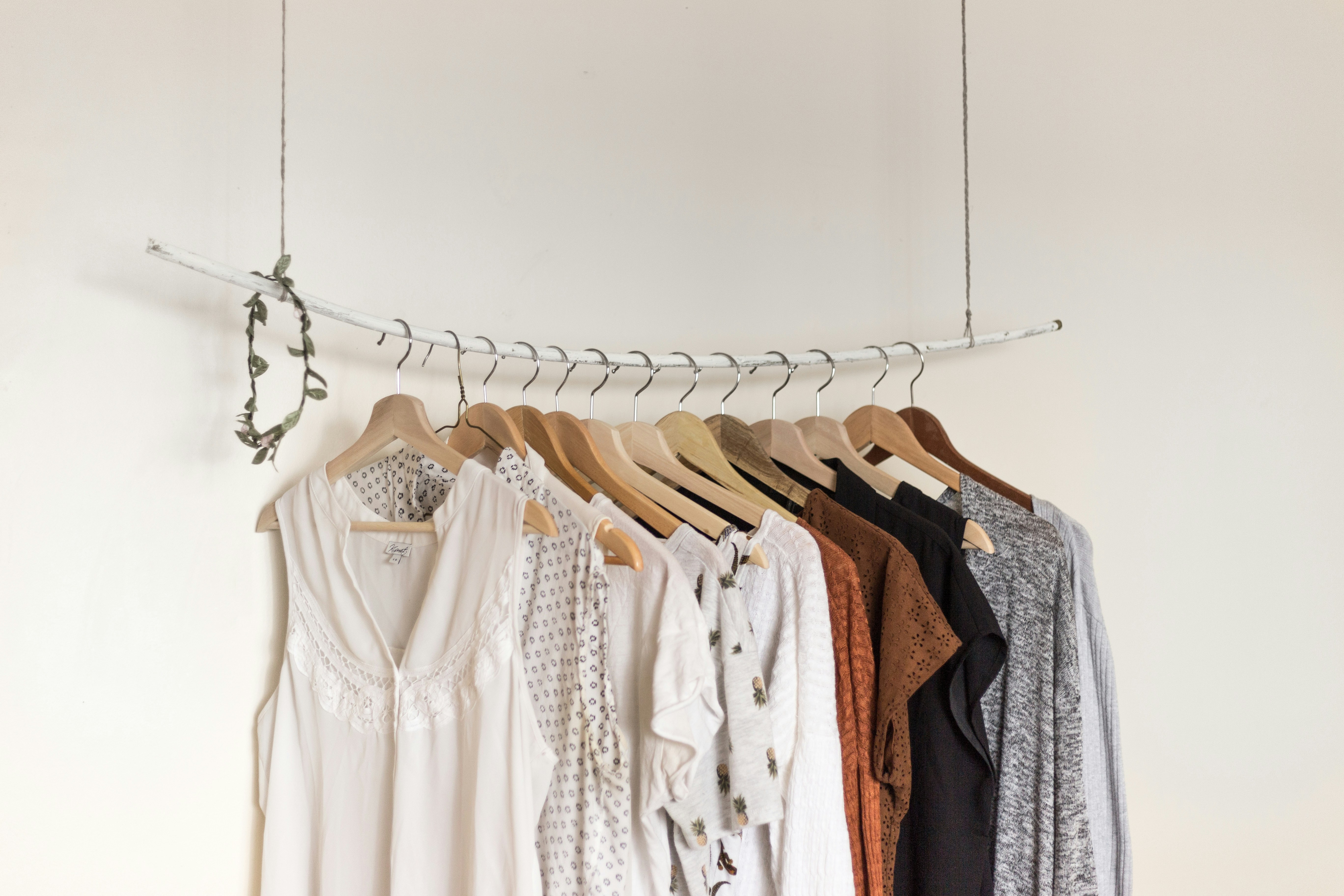
Neutrals—including black, white, gray, beige, and navy—form the psychological foundation of most wardrobes while carrying their own significant associations. These colors function as emotional stabilizers but are far from psychologically neutral:
- Black conveys authority, sophistication, and power but can create distance and formality. Research shows it's perceived as the most authoritative color, explaining its prevalence in professional and formal contexts.
- White suggests purity, simplicity, and efficiency. Studies indicate white environments enhance cognitive precision but may reduce creative thinking.
- Gray communicates professionalism and neutrality but can read as indecisive or unemotional when used extensively.
- Beige and brown create perceptions of reliability, approachability, and groundedness, though they may also register as conventional rather than dynamic.
"Black is not sad. Bright colors are what depresses me. They're so... empty. Black is poetic. How do you imagine a poet? In a bright yellow jacket? Probably not." — Ann Demeulemeester, fashion designer
The psychological impact of neutrals is often determined by texture, proportion, and context rather than the inherent properties of the colors themselves, making them exceptionally versatile for strategic wardrobe building.
Personal Coloring and Psychological Harmony
The psychological impact of color in fashion is significantly influenced by the interaction between clothing colors and the wearer's personal coloring—skin tone, hair color, and eye color. This relationship affects not only aesthetic harmony but also how color psychology functions in practice, as the same hue can create dramatically different impressions depending on this interaction.
Color analysis systems categorize personal coloring into seasonal types (Spring, Summer, Autumn, Winter) or more nuanced variations, identifying which color families create harmony with an individual's natural coloring. These systems are based on the understanding that harmonious color relationships create a sense of balance and authenticity that enhances the psychological effects of color choices.
Research in visual perception demonstrates that when clothing colors harmonize with personal coloring, several psychological benefits occur:
- The wearer appears more authentic and approachable
- Facial expressions read more clearly, enhancing nonverbal communication
- The person is perceived as healthier and more vibrant
- The intended psychological message of the color is reinforced rather than undermined
Conversely, disharmonious color relationships can create psychological disconnects where the intended message of a color is lost or distorted. For example, a power red that clashes with skin undertones may communicate discomfort rather than confidence, regardless of the color's inherent psychological properties.
Understanding your personal color harmony allows for strategic color choices that maximize psychological impact. For instance:
- Individuals with high-contrast coloring (typically Winter types) can effectively wear the bold colors associated with authority and impact
- Those with soft, muted coloring (often Summer or Autumn types) may better communicate authenticity and approachability through correspondingly softer hues
- Clear, bright personal coloring (typically Spring types) harmonizes with the energetic, optimistic colors that communicate creativity and enthusiasm
This personalized approach to color psychology recognizes that while colors have general psychological associations, their effectiveness depends on how authentically they integrate with the individual. The most powerful color choices align the intended psychological message with colors that create visual harmony with personal coloring.
Professional color analysis can provide specific guidance, but general principles include examining whether your coloring has warm or cool undertones, high or low contrast, and clear or muted characteristics. These fundamental aspects of personal coloring significantly influence which psychological color effects will read most authentically on you.
Strategic Color Application in Wardrobe Building
Applying color psychology principles to your wardrobe requires balancing general color effects with personal preferences, lifestyle needs, and individual coloring. This strategic approach transforms color from a purely aesthetic consideration to a powerful tool for communication and emotional management. Follow these steps to develop a psychologically effective color strategy for your wardrobe.
- Identify your color objectives: Begin by clarifying what you want your clothing colors to accomplish. Different contexts may require different psychological effects:
- Professional environments might prioritize colors that communicate competence and authority
- Creative fields may benefit from colors that signal innovation and artistic sensibility
- Social settings might call for colors that enhance approachability and connection
- Personal time might focus on colors that support your emotional wellbeing
- Create a personalized color palette: Develop a cohesive color collection that serves your objectives while harmonizing with your personal coloring. This typically includes:
- Core neutrals (3-4 colors) that form the foundation of your wardrobe
- Primary accent colors (2-3 colors) that create your signature look and carry key psychological messages
- Secondary accent colors (3-4 colors) that provide variety and serve specific contextual needs
- Map colors to specific contexts: Different environments may benefit from different color psychology applications. Consider creating context-specific mini-palettes:
- Work wardrobe colors that align with your industry's expectations while supporting your professional goals
- Social wardrobe colors that express your personality and enhance interpersonal connections
- Home wardrobe colors that support your emotional needs and psychological wellbeing
- Implement strategic color placement: The psychological impact of color varies depending on where it appears in an outfit:
- Colors near the face have the strongest effect on how your expressions and communications are perceived
- Large blocks of color create stronger psychological impacts than small accents
- Color combinations create complex psychological messages that can reinforce or modify the effect of individual hues
- Use color for emotional self-regulation: Develop awareness of how different colors affect your own mood and energy levels, then use this knowledge proactively:
- Select energizing colors when you need motivation or confidence
- Choose calming colors when facing stressful situations
- Use mood-elevating colors during challenging seasons or circumstances
When applying these principles, remember that color psychology operates on both conscious and unconscious levels. While some color effects are immediate and obvious, others work subtly to create cumulative impressions over time. Consistency in your color strategy helps build a coherent personal brand and psychological presence.
Consider documenting your color strategy with physical or digital color palettes, noting the psychological intentions behind different choices. This reference can guide shopping decisions and help you evaluate whether potential purchases align with your color psychology goals. Over time, this strategic approach creates a wardrobe where colors work together to support your objectives rather than creating psychological contradictions or confusion.
Finally, recognize that effective color psychology in fashion balances science with personal expression. While research provides general guidelines about color effects, your individual associations and experiences with colors matter. The most powerful color strategy honors both the universal psychological properties of colors and your unique relationship with them.
Evolving Perspectives in Fashion Color Psychology
The field of color psychology in fashion continues to evolve, influenced by emerging research, changing cultural contexts, and technological developments. Several significant trends are reshaping our understanding of how colors affect perception and emotion in clothing choices.
Neuroscience research is providing increasingly sophisticated insights into color's effects on the brain. Advanced neuroimaging techniques now allow researchers to observe neural responses to different colors with unprecedented precision. Recent studies using electroencephalography (EEG) have demonstrated that color processing begins within 100 milliseconds of visual exposure—before conscious awareness—confirming color's role in forming immediate impressions. This research is revealing more nuanced understandings of how colors influence emotion, with findings that sometimes challenge traditional associations.
Cultural evolution is transforming color psychology as globalization and social media create more fluid color meanings. Traditional color associations are being recontextualized as cultural exchange accelerates. For example:
- Pink has undergone significant psychological repositioning, evolving from a strongly gendered color to one with more complex associations including strength and activism
- Black has expanded beyond Western associations with formality and mourning to incorporate influences from minimalist design philosophies and avant-garde fashion
- Traditional cultural color symbolism is gaining wider recognition, creating more nuanced global understanding of colors like red (auspicious in Chinese culture) and white (associated with mourning in many Asian traditions)
Technological developments are creating new possibilities for color in fashion. Digital design tools allow for more precise color formulation and communication, while innovative dyeing processes and color-changing materials introduce dynamic color experiences. These technologies are enabling more personalized approaches to color psychology:
- Augmented reality applications that allow users to visualize how different colors affect their appearance and presence
- Biometric wearables that could potentially recommend colors based on physiological and emotional states
- Customization platforms that create garments in precise color formulations optimized for individual coloring and psychological objectives
Sustainability considerations are also influencing color psychology as awareness grows about the environmental impact of dyeing processes. Natural dyes and low-impact coloration methods are gaining prominence, potentially shifting aesthetic preferences toward colors achievable through less resource-intensive processes. This trend suggests a future where the psychological associations of colors may include their environmental footprint, with sustainable colors carrying positive emotional connotations regardless of the specific hue.
As these trends converge, we're moving toward more personalized, context-sensitive, and culturally nuanced applications of color psychology in fashion. Rather than rigid rules about color meanings, the future suggests more adaptive frameworks that consider individual differences, cultural contexts, and specific situations when interpreting color's psychological effects.
Conclusion
The psychology of color in fashion represents a fascinating intersection of science, culture, and personal expression. By understanding how different hues affect both our own emotional states and others' perceptions, we gain a powerful tool for more intentional and effective wardrobe choices. Color becomes not just an aesthetic consideration but a form of nonverbal communication and emotional self-care.
The most powerful application of color psychology comes from balancing universal principles with personal context. While research provides valuable insights into general color effects, these must be adapted to individual coloring, preferences, and circumstances. The colors that communicate confidence, creativity, or approachability most effectively for you depend on this personalized approach.
As you develop your relationship with color, consider moving beyond instinctive preferences to strategic choices that support your goals and wellbeing. Experiment with colors outside your usual palette, noting both how others respond and how different hues affect your own mood and energy. This exploration often reveals surprising connections and possibilities that expand your color vocabulary.
Ultimately, the most sophisticated use of color psychology in fashion creates alignment between your inner experience and outer expression. When the colors you wear authentically reflect your personality while strategically supporting your objectives, they become a seamless extension of your presence rather than a costume or mask. This authentic alignment is where the true power of fashion color psychology lies—not in manipulating perceptions, but in creating visual harmony that enhances genuine communication and wellbeing.
Frequently Asked Questions
How can I determine which colors work best with my skin tone?
The most reliable approach is professional color analysis, but you can self-assess by examining your skin's undertone (warm, cool, or neutral) and contrast level. Test colors by holding them near your face in natural light and observing whether they make your skin look vibrant or dull, your features defined or washed out. Cool undertones typically harmonize with jewel tones and colors with blue bases, while warm undertones complement earth tones and colors with yellow bases. Your contrast level (the difference between your hair, skin, and eyes) determines whether you look best in bold or subtle color intensities. High-contrast individuals can wear more dramatic colors, while low-contrast individuals often look best in softer, more blended hues.
Do color psychology principles work the same way across different cultures?
No, while some color responses appear to be somewhat universal (like red's stimulating effect), many color associations vary significantly across cultures. For example, white represents purity in Western traditions but mourning in many Eastern cultures. Yellow signifies happiness and optimism in American contexts but can represent jealousy in German associations. When applying color psychology in multicultural environments, consider the cultural background of your audience. In global professional contexts, neutrals like navy, gray, and black tend to have the most consistent interpretations across cultures, making them safer choices when cultural color associations are unclear.
How can I use color to appear more authoritative in professional settings?
Research consistently shows that darker colors, particularly navy blue and charcoal gray, communicate authority and competence across most professional contexts. For high-stakes situations requiring maximum authority, dark suits with white or light blue shirts create a high-contrast look that commands attention. Strategic use of red—such as a red tie, scarf, or blouse—can enhance perceptions of confidence and decisiveness. However, context matters significantly; creative industries may associate authority with different color choices than traditional corporate environments. The key is matching color authority signals to your specific professional context while ensuring the colors harmonize with your personal coloring for authenticity.
Can wearing certain colors actually change my mood or performance?
Yes, research supports that colors can influence both psychological state and performance metrics. This occurs through several mechanisms: physiological responses (like red increasing heart rate), psychological associations, and the feedback loop created when we feel confident in how we look. Studies have shown that wearing red can enhance performance in competitive activities, blue can improve creative thinking, and yellow can increase optimistic outlook. To leverage these effects, identify which colors consistently affect your mood positively, then strategically incorporate them when you need specific psychological benefits. For example, wear energizing colors when motivation is low or calming colors before high-pressure situations.
How do I build a cohesive wardrobe with color psychology in mind?
Start by identifying 2-3 neutrals that harmonize with your coloring to form your wardrobe foundation. Then select 2-3 signature colors that both flatter you and communicate your desired psychological message (e.g., blue for trustworthiness, purple for creativity). Ensure these core colors work together by choosing hues with similar undertones and intensity levels. Build around this core with complementary accent colors for specific needs. Create a physical or digital color palette as a reference for shopping decisions. When adding new items, consider not just whether you like the color individually, but how it works with your existing palette and psychological objectives. This systematic approach creates a wardrobe where colors work together cohesively while supporting your communication goals.
Malik Mohsin Saleem Khan
Founder
Author bio information